
How to Use Color Thresholds to Find Better Photos
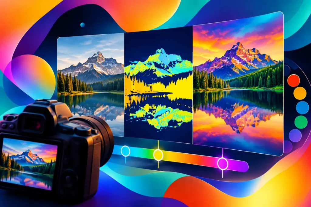
A photo can be technically orange without feeling orange. A small terracotta mug on a white table may contain orange at 5%, while a late-afternoon wall, a rust-colored outfit, and a sunset could be 60% orange. That difference is why learning how to use color thresholds changes the way you search a camera roll. You are not asking whether a color appears somewhere in an image. You are asking whether that color carries enough visual weight to belong in your next post.
For creators planning a warm grid, designers gathering references, or anyone trying to find the shots that give a caption room to breathe, a color threshold turns a vague visual instinct into a useful search condition.
What a Color Threshold Actually Measures
A color threshold sets a minimum share of an image that must fall into a chosen color category before the image appears in your results. Think of it as a floor, not a label.
If you search for blue at 20%, you may find a portrait in front of a blue wall, a beach photo with a wide strip of water, or a product shot with a saturated blue background. Search for blue at 60%, and the results become more specific: open sky, ocean scenes, painted surfaces, or graphics where blue dominates the frame.
This matters because color affects an image before a viewer notices its subject. A pale sky can make a post feel spacious. Deep green can make a sequence feel grounded and outdoorsy. Cream and beige can create a calmer rhythm between busier, more colorful images. A simple color tag cannot distinguish a tiny yellow flower from a photo that is mostly yellow. A threshold can.
Color measurement is not a judgment about whether a photo is good. It is a way to describe how much visual space a hue occupies, so you can retrieve images that work together for a specific editorial purpose.
Start With the Role the Photo Needs to Play
The most useful threshold is rarely the highest one. Start by deciding what job the image needs to do in your sequence.
If you need a strong palette anchor – the photo that makes a run of neutral posts feel intentionally warm – begin with a higher threshold. A search for orange or pink at 50% or more should favor images where that color is hard to miss. These are the photos that establish a mood at a glance.
If you need supporting images, lower the threshold. At 15% to 30%, a color can still tie an image into a palette without taking over the frame. This is useful for lifestyle photos, portraits, food, and travel images, where the desired hue might appear in clothing, an architectural detail, a table setting, or a patch of landscape.
For a clean, minimal sequence, the color you want may not be the only thing that matters. You may be looking for blue at 40%, for example, but only in photos with low visual busyness. That can separate a calm blue sky or a plain painted wall from a crowded pool scene full of competing colors and detail.
How to Use Color Thresholds Without Missing the Best Matches
Begin broad enough to learn what your library contains, then refine based on the results. This is less about finding one perfect number and more about seeing how your own photos distribute color.
A practical starting point is 20%. At that level, the selected color is usually meaningful to the composition, but the search still leaves room for variety. Browse the results and ask a direct question: do these photos feel like the color is part of the scene, or does it actually shape the image?
If too many results feature the color as a minor accent, raise the threshold in small steps. Moving from 20% to 35% can remove images where the hue is incidental. Moving from 35% to 60% can shift the search toward backgrounds, landscapes, large surfaces, and color-forward compositions.
If the result set becomes too narrow, lower the threshold rather than immediately switching colors. Camera photos rarely behave like flat design files. Shadows, skin tones, highlights, mixed lighting, and texture all affect how much of a hue is measured. A photo that feels blue to you may include enough gray, white, or green to fall below a strict blue requirement.
The right setting depends on the photo type. A 40% threshold can be realistic for a sky photo but overly strict for a portrait. For people, food, interiors, and product images, a 15% to 30% threshold often gives you more useful palette-compatible options.
Use a Second Color to Control the Mood
A single threshold finds a dominant visual direction. Adding a second color helps define the relationship between colors.
Say you are planning a set of late-summer posts. Orange at 25% can surface warm walls, sunlit skin, drinks, flowers, and sunset scenes. Add blue at 15%, and you may narrow the selection toward images where warmth is balanced by sky, water, denim, or cool shadows. The result is not simply “orange photos” or “blue photos.” It is a more specific warm-cool conversation.
This is especially helpful when a feed has an established palette but needs variation. Beige at a moderate threshold can find quiet, neutral images. Pair it with green at a lower threshold to find natural scenes that still feel restrained rather than vividly saturated. Pair pink with red to find images that read as romantic or playful without requiring one hue to fill the whole frame.
When using two colors, avoid setting both thresholds too high unless you want graphic, highly color-blocked images. Most photographs divide space among several hues. One primary threshold and one lighter supporting threshold usually reflects how real scenes are composed.
Add One More Condition Only When It Clarifies the Search
Color tells you about palette, not necessarily subject, date, or visual density. If you have found a promising color range but still have hundreds of images, add a condition that reflects your actual publishing need.
For example, search for green at 30% and low busyness when you need a calm outdoor background for text or a Story slide. Search for orange at 20% with a recognized food subject when you are batching restaurant content. Search for blue at 25% within a date range when you want images from one beach trip that will sit together naturally.
Keep the logic purposeful. Three conditions can create a very precise overlap, but precision is not always the goal. If a search returns too few photos, remove the least essential condition first. A workable content plan often benefits from a few near-matches that you can crop, edit, or use as a transitional post.
Common Threshold Mistakes
The most common mistake is treating 0% as meaningful. If a color is allowed to appear at any amount, a tiny object, reflection, or distant sign can qualify an image. That may be useful when you are trying to locate a particular detail, but it is not a reliable way to build a coherent palette.
Another mistake is assuming high thresholds produce better results. They produce stronger color dominance, which is different. A 70% yellow photo may be exactly right for a bold campaign graphic and completely wrong for a subtle lifestyle carousel. Let the intended visual role set the threshold.
Finally, do not expect a named color to match every shade your eye groups with it. Photos live in mixed light. A dusty mauve wall may lean pink, purple, or gray depending on exposure and surrounding colors. If your expected results are absent, test a neighboring color category at a lower percentage. The goal is to retrieve images that look right together, not to win an argument with a label.
Turn Search Results Into a Publishing System
Color thresholds are most valuable when they reduce the decision fatigue that happens after the search. Once you have a useful set of matches, save it mentally as a working group: strong anchors, quieter supporting frames, and flexible images that could bridge two palette directions.
Filters makes this concrete by measuring color share locally on your device, including the second-most-prominent color, then letting you combine color with up to two additional conditions. Nothing leaves your phone. No account, no sign-in, no cloud upload of your library. The result is a search process that can be both visually exact and private.
Before you publish, place two or three candidate images beside the posts already scheduled. A threshold can find the right amount of a hue, but your final choice should still account for crop, brightness, subject placement, and the feeling of the sequence. Use the numbers to stop scrolling. Use your eye to choose the photo that makes the next one look better.


