Are Local Photo Searches Private on Your iPhone?
Are local photo searches private? See what stays on your device, what may reach the cloud, and how to choose a safer photo search…
iPhone, iPad & Mac
Your library already knows which shots are mostly orange, which ones are calm and which are chaos. Filters is the app that lets you ask. Stack up to three conditions — a colour, a level of visual busyness, a subject — and see the matches the moment they overlap.
Orange ≥ 60%
Clean
Food
118 matches
How it works
Every filter you add is a circle. Where the circles overlap is your result, and the number in the middle updates as you drag the thresholds — so you can see a query get tighter instead of guessing at it.
On first launch it works through your photos and records what each one is made of: which hue owns the frame and by how much, how much visual detail it carries, and which subjects it contains. That index is a local cache — it never leaves the device, and it is what makes every later query instant.
Pick a colour and set how much of the frame it has to own. Add a busyness level. Add a subject, a date range, or favourites only. Each one becomes a circle in the Venn, and the centre shows the live match count as you tune it.
Ask for busy crimson food photos from a fortnight in March and you may well get zero. Rather than an empty screen, Filters offers one-tap adjustments that actually have results behind them — drop the threshold to 45%, widen the dates, try rose instead.

Colour dominance
Photo apps that search on colour tell you a picture contains a hue somewhere. Filters measures how much of the frame each hue actually owns, then lets you set the bar. Orange at 20% is a jacket in the corner. Orange at 60% is a sunset.
One number rarely describes a photo. Filters reports the runner-up as well, so a frame reads as 32% green + 10% purple — the lavender field, not the lawn. That second reading is what separates two photos with the same dominant hue and completely different moods.
Twenty-one named hues run around the wheel from red to crimson, with the gaps filled in where it matters — spring and mint sit between green and teal, sky and azure between cyan and blue. Photographs live in those gaps.
White, grey and black sit outside the wheel, because a snowfield and a night shot have no hue to be dominant. They get their own filters.
The other axes
Two photos can be equally blue and feel nothing alike — one an empty sky, the other a crowded pool. Busyness separates them, subjects narrow them, and favourites and dates do the ordinary work every search needs.
Wide, uncluttered frames — an empty sky, a painted wall, a plate on a table. The shots that give a caption room to breathe.
A clear subject with a settled background. Portraits, street corners, most of what a camera roll is actually made of.
Dense visual detail edge to edge — foliage, market stalls, crowds, patterned interiors. Loud frames that need quiet neighbours.
Filters uses Apple's Vision framework to tag what is in each photo, then caches the answer so it only ever does the work once. No model is downloaded mid-query and no image is sent anywhere to be classified.
Favourites you have already starred in Photos are readable as a filter, which turns “my good photos, in green” into a single query. Date ranges cut a query to a trip, a season, or the fortnight you actually care about.
What people use it for
Colour is how a grid holds together, how a board reads, and how a set of Stories feels like one set. Filters turns that from an eye exercise into a query.
Pick the hue your account already leans on, set the threshold high, and you have your shortlist for the next nine squares. Drop it to 40% and you get the softer frames that bridge one block of colour into the next.
Text needs somewhere to sit. Filter for Clean and you get the shots with room in them — skies, walls, water — rather than scrolling past four hundred busy ones to find three.
Boards live or die on consistency. Query a single hue across your whole library and the set arrives already coherent, instead of being assembled a picture at a time.

Privacy
Filters has to look at every photo you own to be useful. So it does that where the photos already are, and stops there.
Pricing
There is no crippled free tier here. Every filter, the full three-way query, second colours and suggestions all work for nothing — on the last twelve months of your library. Pro is the same app pointed at everything you have ever shot.
Free
$0
Last 12 months of photos
Pro — Lifetime
$19.99
One payment, no renewal
Pro — Yearly
$9.99/year
Cancel any time in Settings
Prices in US dollars; your local App Store price may differ. Purchases are made through Apple and restore across your devices.
Questions
It reads your library once and measures how much of each frame every hue actually owns — not the average colour, the share of the frame. The result is a small index of numbers: dominant hue, second hue, share percentages, a busyness score, and any subjects it recognised. That index is what your queries search, which is why results come back instantly instead of re-scanning thousands of photos every time.
It depends on the size of your library and how busy your device is. Filters works through it in the background and picks up where it left off if you close the app, so you can start querying the part it has already covered. After the first pass only new photos need analysing, which happens in seconds.
No. Every stage — colour measurement, busyness, subject recognition — runs on-device using Apple frameworks. There is no account, no upload, no server that sees your photos, and no analytics on what is in them. The index is a local cache; delete the app and it goes with it.
Yes. Filters reads your library through Photos, so an iCloud library behaves like any other. If your device is set to Optimise Storage, Filters asks Photos for what it needs and analyses what comes back — so a library that lives mostly in iCloud still indexes, it just needs a connection while it works through the backlog.
Writing
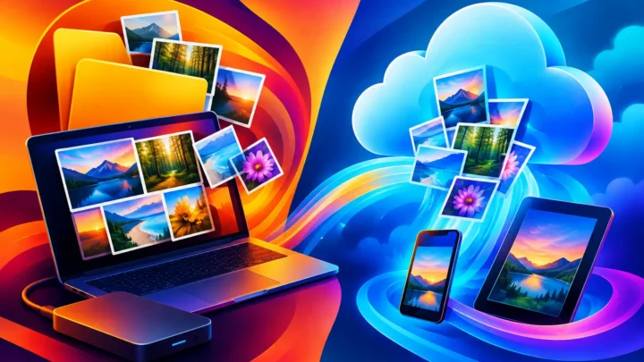
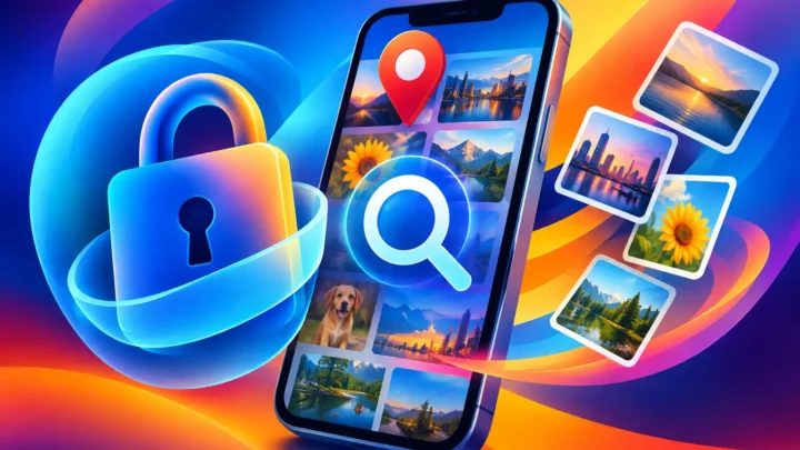
Are local photo searches private? See what stays on your device, what may reach the cloud, and how to choose a safer photo search…
Compare local indexing versus cloud scanning for photo search: speed, privacy, and the practical difference for a large, creative photo library today.
Make date range photo selection faster: narrow a trip, season, or campaign window, then find images that share the color and breathing room you…
Filters is finishing up for iPhone, iPad, and Mac. Free covers the last twelve months of your photos; Pro opens the rest for $19.99 once or $9.99 a year.

Built by the same maker, for the same photo library.
 RawToHEIC
Convert RAW to HEIC and reclaim your storage — without leaving Apple Photos.
Learn more
RawToHEIC
Convert RAW to HEIC and reclaim your storage — without leaving Apple Photos.
Learn more
 MergeHDR
Merge bracketed exposures into one clean HDR photo, right on your device.
Learn more
MergeHDR
Merge bracketed exposures into one clean HDR photo, right on your device.
Learn more
 Photo Geotag
Put photos with no location back on the map, from the geotagged shots around them — on-device.
Learn more
Photo Geotag
Put photos with no location back on the map, from the geotagged shots around them — on-device.
Learn more